Get in touch
T: 07766469734
E: info@websitesandseo.co.uk
T: 07766469734
E: info@websitesandseo.co.uk
The Role of Mobile-First Design in SEO: Best Practices
info@websitesandseo.co.uk

One of the most significant shifts in recent years has been the prioritization of mobile-first design in SEO strategies. As the number of mobile users continues to skyrocket, optimising websites for mobile devices has become not just a recommendation but a necessity. In this blog post, we’ll delve into the importance of mobile-first design in SEO and explore some best practices to ensure your website ranks well and delivers an exceptional user experience across all devices.
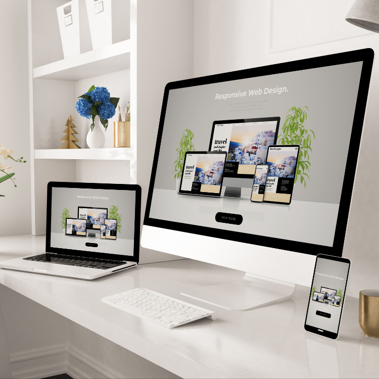
First and foremost, let’s address why mobile-first design matters for SEO. Google, the search engine behemoth, made the switch to mobile-first indexing in 2019, meaning it predominantly uses the mobile version of a website’s content for indexing and ranking. This shift underscores the significance of having a mobile-responsive website. If your site isn’t optimised for mobile devices, you risk losing visibility in search results, which can have detrimental effects on your organic traffic and ultimately your bottom line.
Beyond search engine rankings, mobile-first design directly impacts user experience (UX). In today’s fast-paced world, users expect websites to load quickly and function seamlessly on their smartphones and tablets. A responsive design ensures that your site adapts to various screen sizes, providing a consistent and user-friendly experience across all devices. By prioritizing mobile-first design, you can reduce bounce rates, increase time spent on site, and ultimately improve conversion rates.
So, what are some best practices for implementing a mobile-first design approach? Let’s explore a few key strategies:
1. Prioritize Page Speed:
Mobile users are typically on-the-go and impatient. Ensuring that your website loads quickly on mobile devices is crucial for retaining users and reducing bounce rates. Compress images, minimize HTTP requests, and leverage browser caching to optimise page speed.
2. Streamline Navigation:
Simplify navigation menus and ensure that links and buttons are easily clickable on touchscreens. Aim for a clean and intuitive design that allows users to find what they’re looking for with minimal effort.
3. Optimize Content for Mobile:
Tailor your content for mobile consumption by using concise headlines, shorter paragraphs, and bullet points. Make sure text is legible without zooming in, and avoid using intrusive pop-ups that can hinder the user experience on smaller screens.
4. Implement Responsive Design:
Invest in a responsive design framework that automatically adjusts your website’s layout and content based on the device it’s being viewed on. This approach eliminates the need for separate mobile and desktop versions of your site, streamlining maintenance and ensuring consistency across all platforms.
5. Test, Test, Test:
Regularly test your website across various mobile devices and browsers to identify any usability issues or display inconsistencies. Conduct user testing to gather feedback and make iterative improvements to your mobile design.
Mobile-first design is no longer optional – it’s a fundamental aspect of SEO and UX optimization. By prioritizing mobile responsiveness and implementing best practices, you can enhance your website’s visibility, engage users, and drive conversions. Stay ahead of the curve by embracing the mobile-first mindset and delivering exceptional experiences to users, regardless of the device they’re using.
If you are looking for SEO
or Website Design
support, reach out to our team!

Unlock the secrets of SEO for small businesses with our comprehensive guide to optimising website speed. Learn key strategies to enhance your online visibility, attract more visitors, and drive growth.

Discover the art of SEO-friendly web design: striking the perfect balance between creativity and optimisation. Learn essential tips to enhance user experience, integrate keywords, optimise multimedia, and more. Elevate your website's visibility and engagement with expert insights. Read on for valuable guidance in crafting a visually stunning and user-friendly online presence.
Discover the top 10 website design trends for 2024, from dark mode dominance to AI-powered personalization. Stay ahead of the curve with insights on immersive 3D elements, sustainable design practices, and more.